*NOTE* This is posted here to answer a question on the forums. It is not required nor is it encouraged for any submission as the process introduces custom scripts that need to be included with the Levels and Objects Folders. But for your interest here is a tutorial:
Tutorial – Changing Playable Character
The purpose of this tutorial is to change the character model from the nanosuit to something a bit more acceptable for the purposes of architectural visualization.
Open Crysis Sandbox 2
Open the Character Editor: View>Open View Pane>Character Editor
Or Click on the Green Person symbol at the right of the top menu bar
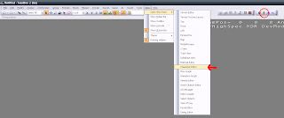
Note: The green person symbol is with the Material editor, Database View and Flowgraph shortcuts – all very useful shortcuts.
The Character Editor will open up and look similar to the following image
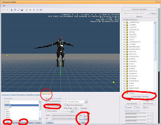
The parts of the Character Editor we are concerned with for the purposes of the tutorial are marked.
What we will be doing is changing a part of the game script (don’t worry the scripting is easy) to call a different model instead of the nanosuit model.
There is a trick to it though.
The nanosuit character is set up differently to all the others, in a way that prevents us from simply swapping it for another character model, as the animations and materials will not show properly.
Basically if we just change the model in the script to an existing character it will still show up with some nanosuit textures showing at the same time as the new character textures.
We need to edit an existing character and replace its attachments.
Open an existing character
File>Open (in the character editor)
Find this particular character model:
Game/objects/characters/human/asian/nk_soldier/nk_soldier_jungle_light_leader_01
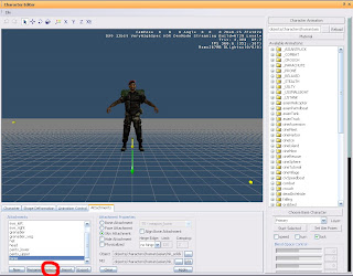
Remove all attachments
You should be left with nothing visible in the preview window.
IMPORTANT If after removing all the attachments there is still some part of the character left make sure you have selected the character listed above to edit. Even if you want the part that is left you need to add it to a blank character file or there will be issues with nanosuit textures showing up.
Now we add our own attachments.
This will usually be done by adding a body, hands and a head
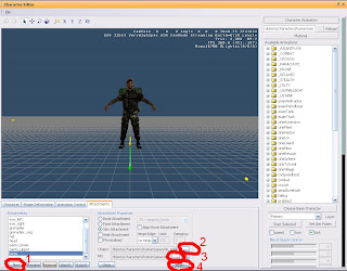
Step 1: Make a new attachment and in the popup enter a name for it, ie body, hands, head
Step 2: Find a model
Model should be .chr files, not .cdf. Cdf are what the completed character is saved as.
I used this model: objects/characters/human/us/officer/officer.chr
Step 3: Assign a material to the model
The material to assign should be located in the same folder location as the mesh itself and should be of the same name.
The material selection for characters seems a bit screwy so it might be a bit difficult to scroll down to the material you need. If you are having trouble try expanding some of the materials below the one you need and then scrolling down – seemed to work for me
Step 4: Apply to see changes in the preview window
Do this for the remaining body parts
They should all be added as Skin Attachments (as opposed to Bone or Face attachments)
For you reference I used
Body: objects/characters/human/us/officer/officer.chr
Hands: objects/characters/human/hands/officer_hands.chr
Head: objects/characters/heads/us/caucasian_01/caucasian_01.chr
If in doubt of where to find good models open up an existing character and see where their models are located.
Finally
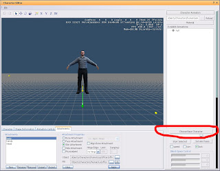
Click the “Choose Base Character” button
This reloads all the relevant animations for the character and you can now open click on them and see how they work on your character.
Save your character to Game>Objects>Character
Use a unique name and save as a .cdf file
Alternatively you can save the character in a custom folder within the Objects folder structure so that it is easier to transfer between computers.
Now to change the script
The scripts are all bundled up into .pak files that we need to open up.
They are located in the Game folder of Crysis Wars
The one we want is GameData.pak
Copy it to another location – desktop should be ok
Change the extension from .pak to .zip – ignore the warning
Right click and “extract to…”
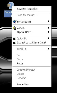
This will take a while
You will get the following folders
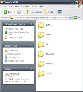
Find the player.lua file in
GameDataPAK\Scripts\Entities\actor
Copy it to C:\Program Files\Electronic Arts\Crytek\Crysis Wars\Game\Scripts\Entities\actor
Open the copied file using notepad and you will see the following:
Script.ReloadScript( "SCRIPTS/Entities/actor/BasicActor.lua");
Player = {
AnimationGraph = "PlayerFullBody.xml",
UpperBodyGraph = "PlayerUpperBody.xml",
type = "Player",
foreignCollisionDamageMult = 0.1,
vehicleCollisionDamageMult = 7.5,
vehicleCollisionDamageMultMP = 0.4,
Properties =
{
-- AI-related properties
soclasses_SmartObjectClass = "Player",
groupid = 0,
species = 0,
commrange = 40; -- Luciano - added to use SIGNALFILTER_GROUPONLY
-- AI-related properties over
voiceType = "player",
aicharacter_character = "Player",
Perception =
{
--how visible am I
camoScale = 1,
--movement related parameters
velBase = 1,
velScale = .03,
--ranges
sightrange = 50,
} ,
--
fileModel = "objects/characters/human/us/nanosuit/nanosuit_us_multiplayer.cdf",
clientFileModel = "objects/characters/human/us/nanosuit/nanosuit_us_fp3p.cdf",
--fileModel = "objects/characters/human/asian/nanosuit/nanosuit_asian_fp3p.cdf",
fpItemHandsModel = "objects/weapons/arms_global/arms_nanosuit_us.chr",
--fpItemHandsModel = "objects/weapons/arms_global/arms_nanosuit_asian.chr",
objFrozenModel= "objects/characters/human/asian/nk_soldier/nk_soldier_frozen_scatter.cgf",
},
PropertiesInstance = {
aibehavior_behaviour = "PlayerIdle",
},
Etc.
It continues on for quite a while.
We need to change the clientFileModel to the new character you created. Ie change the highlighted text to the path of your new character .cdf file.
Save the .lua file
Now when you open the editor and game this player.lua file will be read before the one that is in the .pak file effectively overwriting the nanosuit guy with a normal, presentation acceptable model
NOTE: If moving between computers, this script file needs to be copied into the same location on each computer. Crysis reads scripts from the Scripts folder only so it cannot be put with all your other custom content in the Objects folder.
This makes file transfer a bit tedious, especially if you have lots of different scripts, to change more than just the character model. This is called a mod and there is an alternate folder structure that can be used for this purpose but is not in the scope of this tutorial.
NOTE: A common issue with the character editor is that the bottom couple of buttons are cut off and can’t be accessed no matter how you resize it. This is a dpi issue on the computer you are using. If you are having this problem
Right click somewhere on the desktop
Click Properties
Click on the Settings tab
Click the Advanced button
Click the General tab
And under the DPI setting scroll down and change it to Normal size (96 DPI on the computer I am using).
Tuesday, June 8, 2010
Monday, May 24, 2010
Crysis Video Tutorials
Below is a link to 2 video tutorials covering the Initial Setup of a Crysis level and Assigning Textures to your landscape.
**For anyone who downloaded the files before the 31st of May you may have had problems playing the terrain texture tutorial. Below is a new link to each video.
http://www.mediafire.com/file/tnejf3kqlzd/InitialSetup.mov
http://www.mediafire.com/file/unizmnz0i5m/TerrainTexture.mov
**For anyone who downloaded the files before the 31st of May you may have had problems playing the terrain texture tutorial. Below is a new link to each video.
http://www.mediafire.com/file/tnejf3kqlzd/InitialSetup.mov
http://www.mediafire.com/file/unizmnz0i5m/TerrainTexture.mov
Tuesday, May 18, 2010
Experiment 2 Feedback
Adel Zekri
Key strength of the scheme:
The integration with the landscape is quite successful, particularly the ramping that weaves underneath the rectangular prisms
Most significant weakness of the scheme:
With the successful landscape ramping you have achieved the steel ramps seem out of place and unnecessary. It would have been good to see you solve the design issues without resorting to these ramps.
Al-Cham Lee
Key strength of the scheme:
Good use of the quote to bring ideas of adaption and change to your arrangement of spaces
Most significant weakness of the scheme:
Your approach to the landscape is unique but doesn’t provide access to the labs as was intended
Alex Harrington
Key strength of the scheme:
Good use of precedents and successful incorporation of their ideas. Lighting and landscape decisions are well developed
Most significant weakness of the scheme:
Both labs work well individually but by separating them you avoided some design challenges that could have been solved to create a more integrated and balanced scheme.
Angie Kan
Key strength of the scheme:
Positioning of the meeting space in relation to the Stephen Hawking quote works quite well to integrate the landscape with the form and with the greater design intention
Most significant weakness of the scheme:
Little use of the landscape to bring the clients together, made more apparent by the separation of the labs and the appearance that all the spaces are located on the same level.
Belal Bezri
Ideas of 4 dimensionality, trickery (using textures and structure) and ‘irreducible complex systems’ are all evident and work well together.
Most significant weakness of the scheme:
The lack of integration of the two labs and their integration to the landscape could have been developed further. *Couldn’t access Crysis Level, which in your case, with the 4d ideas, was particularly important
Ben Nick Aquino Jnr
Good contrasts and arrangements of building forms and mass, and the application of textures is quite successful to distinguish spaces.
Most significant weakness of the scheme:
Little integration within the landscape or use of the landscape to create the circulation spaces. Also appears to be well in advance of 9 rectilinear prisms. *Couldn’t access Crysis Level
Christof Cuthill
Key strength of the scheme:
Positioning of the scheme within the landscape and application of textures to distinguish spaces
Most significant weakness of the scheme:
The landscape doesn’t really serve to link the spaces together and as a result it is difficult to understand how the spaces work together. *Couldn’t access Crysis Level
Eduardo Meruvion-Perez
Key strength of the scheme:
The relationship of rectangular prisms with each other is quite successful and produces quite a balanced arrangement of spaces
Most significant weakness of the scheme:
While the towers make quite a powerful statement protruding above the landscape, they don’t take advantage of the landscape as a means to bring the clients together.
Hannah Degotardi
Key strength of the scheme:
Use of the landscape to represent your clients ideas is quite successful. Evolution, continuing quest, goal of complete description and fine gradations are all present – it’s just really hard to walk up the ramp
Most significant weakness of the scheme:
Meeting space doesn’t seem to be a space where the two clients would come together, rather just a space where the labs run into one another
Laleh Doroudgar
Key strength of the scheme:
Subtle differences between labs based on each clients requirements. Well positioned within the landscape with a reasonably successful ramping solution
Most significant weakness of the scheme:
Landscape could have been developed further to link more of the lab spaces. Only one texture appears to have been applied which doesn’t help to distinguish the spaces
Lex Yuan
Key strength of the scheme:
Well balanced scheme exploring different arrangements of rectilinear spaces, and well resolved representation of ideas for the Stephen Hawking lab
Most significant weakness of the scheme:
The use of the landscape to connect the spaces is not evident. *Couldn’t access Crysis Level
Michelle Quach
Key strength of the scheme:
Interesting development and position of the spaces, particularly in reference to your 2 dimension quote. The design challenges ideas of 3d and 2d space just as your quote does.
Most significant weakness of the scheme:
The landscape could have been developed further to better link with the lab spaces, and it is unclear how the overall form is broken down into 2 labs and a meeting space.
Priscilla Lynarko
Key strength of the scheme:
Contrast between two labs while still maintaining a link; physically, conceptually and within the landscape is quite successful
Most significant weakness of the scheme:
Landscape could have been further developed to better link the spaces as currently it appears quite unnatural. *Couldn’t access Crysis Level – would have particularly liked to see how the ramp worked in the game
Scott Walsh
Key strength of the scheme:
Use of the electroliquid aggregation as inspiration for the design process, particularly in the way the landscape is formed to provide the meeting space and the ramps
Most significant weakness of the scheme:
The whole complex seems over-scaled, especially within the game environment
Shiny Son
Key strength of the scheme:
Well resolved 9 prisms while keeping your original idea and successful integration of the form within the landscape
Most significant weakness of the scheme:
Whilst Darwin’s lab fits with your design ideas of evolution (in size of space) it could have been developed further with more thought given to what he actually would use the space for. *Couldn’t access Crysis Level
Steven Williams
Key strength of the scheme:
Individual labs are specifically designed with the client in mind with good use of colour as a representation of their ideas and each spaces use.
Most significant weakness of the scheme:
Integration within the landscape and using the landscape to connect the spaces is not evident. By not combining the axos you have missed the opportunity to solve a particular design challenge. Axo drawings don’t appear to be on your blog. *Couldn’t access Crysis level.
Winnie Neo
Key strength of the scheme:
Good experimentation with a variety of spaces including double height voids, colonnades and large balconies
Most significant weakness of the scheme:
Far more than 9 rectangular prisms used which makes the overall scheme quite unbalanced, and, with only one texture applied throughout, quite confusing at times. *Couldn’t access Crysis Level
Winsome Whyte
Key strength of the scheme:
Representation of ideas is well demonstrated in each individual lab, drawing ideas from your quotes and the needs of each client.
Most significant weakness of the scheme:
The separation of the labs avoids dealing with design challenges that a ‘combined axo’ creates. The separation and the landscape between isn’t very successful as a result
Yudong Wu
Key strength of the scheme:
Both the Axo’s and the textures showed promise
Most significant weakness of the scheme:
Incomplete Submission
Key strength of the scheme:
The integration with the landscape is quite successful, particularly the ramping that weaves underneath the rectangular prisms
Most significant weakness of the scheme:
With the successful landscape ramping you have achieved the steel ramps seem out of place and unnecessary. It would have been good to see you solve the design issues without resorting to these ramps.
Al-Cham Lee
Key strength of the scheme:
Good use of the quote to bring ideas of adaption and change to your arrangement of spaces
Most significant weakness of the scheme:
Your approach to the landscape is unique but doesn’t provide access to the labs as was intended
Alex Harrington
Key strength of the scheme:
Good use of precedents and successful incorporation of their ideas. Lighting and landscape decisions are well developed
Most significant weakness of the scheme:
Both labs work well individually but by separating them you avoided some design challenges that could have been solved to create a more integrated and balanced scheme.
Angie Kan
Key strength of the scheme:
Positioning of the meeting space in relation to the Stephen Hawking quote works quite well to integrate the landscape with the form and with the greater design intention
Most significant weakness of the scheme:
Little use of the landscape to bring the clients together, made more apparent by the separation of the labs and the appearance that all the spaces are located on the same level.
Belal Bezri
Ideas of 4 dimensionality, trickery (using textures and structure) and ‘irreducible complex systems’ are all evident and work well together.
Most significant weakness of the scheme:
The lack of integration of the two labs and their integration to the landscape could have been developed further. *Couldn’t access Crysis Level, which in your case, with the 4d ideas, was particularly important
Ben Nick Aquino Jnr
Good contrasts and arrangements of building forms and mass, and the application of textures is quite successful to distinguish spaces.
Most significant weakness of the scheme:
Little integration within the landscape or use of the landscape to create the circulation spaces. Also appears to be well in advance of 9 rectilinear prisms. *Couldn’t access Crysis Level
Christof Cuthill
Key strength of the scheme:
Positioning of the scheme within the landscape and application of textures to distinguish spaces
Most significant weakness of the scheme:
The landscape doesn’t really serve to link the spaces together and as a result it is difficult to understand how the spaces work together. *Couldn’t access Crysis Level
Eduardo Meruvion-Perez
Key strength of the scheme:
The relationship of rectangular prisms with each other is quite successful and produces quite a balanced arrangement of spaces
Most significant weakness of the scheme:
While the towers make quite a powerful statement protruding above the landscape, they don’t take advantage of the landscape as a means to bring the clients together.
Hannah Degotardi
Key strength of the scheme:
Use of the landscape to represent your clients ideas is quite successful. Evolution, continuing quest, goal of complete description and fine gradations are all present – it’s just really hard to walk up the ramp
Most significant weakness of the scheme:
Meeting space doesn’t seem to be a space where the two clients would come together, rather just a space where the labs run into one another
Laleh Doroudgar
Key strength of the scheme:
Subtle differences between labs based on each clients requirements. Well positioned within the landscape with a reasonably successful ramping solution
Most significant weakness of the scheme:
Landscape could have been developed further to link more of the lab spaces. Only one texture appears to have been applied which doesn’t help to distinguish the spaces
Lex Yuan
Key strength of the scheme:
Well balanced scheme exploring different arrangements of rectilinear spaces, and well resolved representation of ideas for the Stephen Hawking lab
Most significant weakness of the scheme:
The use of the landscape to connect the spaces is not evident. *Couldn’t access Crysis Level
Michelle Quach
Key strength of the scheme:
Interesting development and position of the spaces, particularly in reference to your 2 dimension quote. The design challenges ideas of 3d and 2d space just as your quote does.
Most significant weakness of the scheme:
The landscape could have been developed further to better link with the lab spaces, and it is unclear how the overall form is broken down into 2 labs and a meeting space.
Priscilla Lynarko
Key strength of the scheme:
Contrast between two labs while still maintaining a link; physically, conceptually and within the landscape is quite successful
Most significant weakness of the scheme:
Landscape could have been further developed to better link the spaces as currently it appears quite unnatural. *Couldn’t access Crysis Level – would have particularly liked to see how the ramp worked in the game
Scott Walsh
Key strength of the scheme:
Use of the electroliquid aggregation as inspiration for the design process, particularly in the way the landscape is formed to provide the meeting space and the ramps
Most significant weakness of the scheme:
The whole complex seems over-scaled, especially within the game environment
Shiny Son
Key strength of the scheme:
Well resolved 9 prisms while keeping your original idea and successful integration of the form within the landscape
Most significant weakness of the scheme:
Whilst Darwin’s lab fits with your design ideas of evolution (in size of space) it could have been developed further with more thought given to what he actually would use the space for. *Couldn’t access Crysis Level
Steven Williams
Key strength of the scheme:
Individual labs are specifically designed with the client in mind with good use of colour as a representation of their ideas and each spaces use.
Most significant weakness of the scheme:
Integration within the landscape and using the landscape to connect the spaces is not evident. By not combining the axos you have missed the opportunity to solve a particular design challenge. Axo drawings don’t appear to be on your blog. *Couldn’t access Crysis level.
Winnie Neo
Key strength of the scheme:
Good experimentation with a variety of spaces including double height voids, colonnades and large balconies
Most significant weakness of the scheme:
Far more than 9 rectangular prisms used which makes the overall scheme quite unbalanced, and, with only one texture applied throughout, quite confusing at times. *Couldn’t access Crysis Level
Winsome Whyte
Key strength of the scheme:
Representation of ideas is well demonstrated in each individual lab, drawing ideas from your quotes and the needs of each client.
Most significant weakness of the scheme:
The separation of the labs avoids dealing with design challenges that a ‘combined axo’ creates. The separation and the landscape between isn’t very successful as a result
Yudong Wu
Key strength of the scheme:
Both the Axo’s and the textures showed promise
Most significant weakness of the scheme:
Incomplete Submission
Monday, May 10, 2010
Perspectives
Some examples of perspectives:
Classic one point perspective of the Death Star Trench from Star Wars
Ascending and Descending by M.C. Escher. It's actually a 3 point perspective and he has used the perspective to trick the eye. The guards are either always walking up or always walking down.
I can see how the drawing was done but can you see how this was done? There are a few other cool Escher Lego models at www.neatorama.com
A two point perspective from Steven Wiltshire. He has been in the news lately as a autistic savant, having drawn a scene of Sydney from memory. He can draw scenes like these from memory having only spent an hour at the actual place.
Friday, April 30, 2010
Experiment 1 Feedback
The intention of publishing the feedback below is so that all students can benefit by understanding the strengths and weakness’ of a range of projects. Please take the time to review other students work with these comments in mind. If you have any questions or would like any further clarification don’t hesitate to ask me during the studio session.
Adel Zekri
Key strength of the scheme:
Above ground space is quite successful, particularly the flowing enveloping space but also how the mechanical links with it and helps to form the exhibition space
Most significant weakness of the scheme:
The underground space doesn’t work as well as a studio space. There is little functional room, instead it seems to be a path to a viewing platform. On a presentation level the sections and textures are poorly scanned/photographed and shouldn’t be blue.
Al Cham Lee
Key strength of the scheme:
Well chosen and well rendered images of the scheme. The above ground ‘gruesome’ studio provides some interesting spatial arrangements as a result of the sharp angles and maze idea
Most significant weakness of the scheme:
The below ground ‘crumple’ studio could have been taken further. The crumpled sphere isn’t actually visible to the occupant of the space, rather a relatively standard rectilinear space. You are also missing one of the 3 artists on your blog.
Alex Harrington
Key strength of the scheme:
A reasonably resolved scheme that incorporates a series of ideas that had been developed through many vastly different models
Most significant weakness of the scheme:
By keeping the aesthetic of the structure consistent the spaces have lost their individuality and it becomes unclear of how and where each space is separated.
Angie Kan
Key strength of the scheme:
Good use of the exhibition space to link the 2 studio spaces ideas with each other. It has an obvious link with oppose, but also shares the skylight idea of the peace studio space
Most significant weakness of the scheme:
The above ground studio space is very small and unresolved, perhaps it could have been more successful with the extra size you suggested in your section drawing
Belal Bezri
Key strength of the scheme:
Well resolved scheme combining ideas of surround and direction. Use of sound and demonstration of this through your animations is excellent.
Most significant weakness of the scheme:
The separation of exhibition space and the upper studio is unclear perhaps caused by the similar architectural design for both spaces.
Ben Nick Aquino Jnr
Key strength of the scheme:
The above ground ‘fresh’ studio space uses well thought out windows to create a light and open space as you suggest
Most significant weakness of the scheme:
The underground ‘motor’ space could have been taken further – it is essentially a simple rectilinear space. It also could have been linked with the exhibition space more successfully as currently the exhibition space looks to be part of the upper studio rather than a meeting of the 2
Christof Cuthill
Key strength of the scheme:
Ideas behind contemplative space have been realised well in the underground studio, creating a uniform space to encourage contemplation
Most significant weakness of the scheme:
As you identified the buildings are over scaled. Rather than design a space for ‘any kind of sculptor’ more attention should have been given to the specific clients and their needs
Eduardo Meruvia-Perez
Key strength of the scheme:
Integration of the whole scheme to demonstrate idea of unite and contrast. The design of a space that relies on all parts to function and the contrasting of spaces but also how the occupant moves through them is quite successful
Most significant weakness of the scheme:
The overall integration has led to some awkward spaces created to fit with the idea. The exhibition space, for example, doesn’t function very well and is fairly unresolved
Hannah Degotardi
Key strength of the scheme:
The scheme has been well resolved to link the 3 very different spaces together into a holistic design. The design of the stairs and their relationship to the spaces is quite successful
Most significant weakness of the scheme:
The spaces above the datum are a bit over scaled. The ‘introspection’ studio space may have been as successful using just one cylindrical structure. Custom textures not uploaded to your blog.
Laleh Doroudgar
Key strength of the scheme:
Mysterious underground space shows promise, particularly the stairs and tunnels which are more successful than the actual studio space.
Most significant weakness of the scheme:
The underground space is unresolved in terms of what is earth – demonstrated by your positioning of people on the outside of a stair that should be surrounded by dirt. There is also little evidence of an exhibition space.
Lex Yuan
Key strength of the scheme:
Both studio spaces have been derived quite successfully from their words. The Goodwin space has taken quite a unique approach to the word ‘extra’ and being underground
Most significant weakness of the scheme:
The stairs, while unique, don’t seem to be related to the spaces they inhabit. The exhibition space could have been developed further to form more of a link between ‘extra’ and ‘detailed’
Michelle Quach
Key strength of the scheme:
Curiosity space demonstrates some good ideas and spatial sequences, for example, the entry to the stairs and the way they hover above the floor would heighten the curiosity of an occupant
Most significant weakness of the scheme:
The upper studio space is unresolved and the exhibition space missed an opportunity to combine the ideas of curiosity and space, instead it seems to be a continuation of the upper studio space.
Priscilla Lynarko
Key strength of the scheme:
Good attempt at some quite complex spaces, particularly the underground studio space with its pointed ceiling
Most significant weakness of the scheme:
Unclear resolution of the underground space as being underground – there are gaps between the walls and the ceiling that couldn’t occur underground. There is also little evidence of an exhibition space.
Scott Walsh
Key strength of the scheme:
Good development from section drawing through to model And well resolved underground ‘death’ space with stairs
Most significant weakness of the scheme:
The link between the exhibition space and the 2 studio spaces is still unresolved as it appears out of place. Functionally the above ground studio space could have been developed further to help bring the 4 separate spaces together.
Shiny Son
Key strength of the scheme:
Linking of upper Dynamic space with lower cellular space is thoughtfully resolved at the exhibition space
Most significant weakness of the scheme:
The ‘cell’ studio still relies on decoration – the hexagon tunnel for example – to break up what is a fairly standard rectilinear space. The design of the space itself could have embraced the cellular idea more
Steven Williams
Key strength of the scheme:
The beginnings of some interesting structural expression for your above ground studio
Most significant weakness of the scheme:
Exhibition space is unresolved and doesn’t share any link with the studio spaces. There is also a fair bit of supporting material missing from your blog, for example, the relative words for each studio is unclear, as is the design of the stairs. Textures are poorly photographed and I have only found 2 of the 3 animations
Winnie Neo
Key strength of the scheme:
An interesting approach to designing the underground placid space as a series of platforms which set up views of the water.
Most significant weakness of the scheme:
There is little link between the 2 studio spaces – highlighted by the exhibition space being almost indistinguishable from the upper studio space. The lack of doors makes it difficult to see how the circulation of the space would work
Winsome Whyte
Key strength of the scheme:
The underground ‘machine’ space is quite successful with its series of circular discs slipping over each other, combined with a rigid rectilinear stair.
Most significant weakness of the scheme:
The exhibition space could have been developed to have its own identity, rather than appearing as an extension to the above ground studio. Your blog has limited information on your stairs and how they have been designed to fit the architecture
Yundong Wu
Key strength of the scheme:
Bizarre architectural design and unique section animation style has created an interesting submission
Most significant weakness of the scheme:
Images are poorly chosen to show the critical parts of your design and as a result it is unclear how your underground space and your exhibition spaces work
Thursday, April 29, 2010
Removing Display Info to Capture Clear Images
You may have noticed the images you are getting from Crysis Wars have stuff like health and ammo cluttering up the screen. We want to see the Architecture not how many bullets you've got left so there are a few things you can do to get rid of this info.
Andrew Wallace (tutor) has everything you need on his blog http://www.arch1101-2010aw.blogspot.com/ under "Remove Health Ammo and Map" and "Removing Info Text Display in Crysis"
Monday, April 19, 2010
Subscribe to:
Posts (Atom)